Renée Skin
The passion project:
This project was created through memories of my lovely nan who sadly passed away at the grand old age of 102. 102! As a child, I remember kissing her goodbye on a Friday night after we'd visit her for a chippy tea and a spread of sweet treats (literally heaven!). She had the softest cheeks ever. One of her favourite colours was pink so it was evident that this would be featured in the brand.
I wanted to create a brand that captured the essence of delicate, gentle skincare for dry skin - something that felt personal, caring, and elegant, just like my nan.
How I brought it to life:
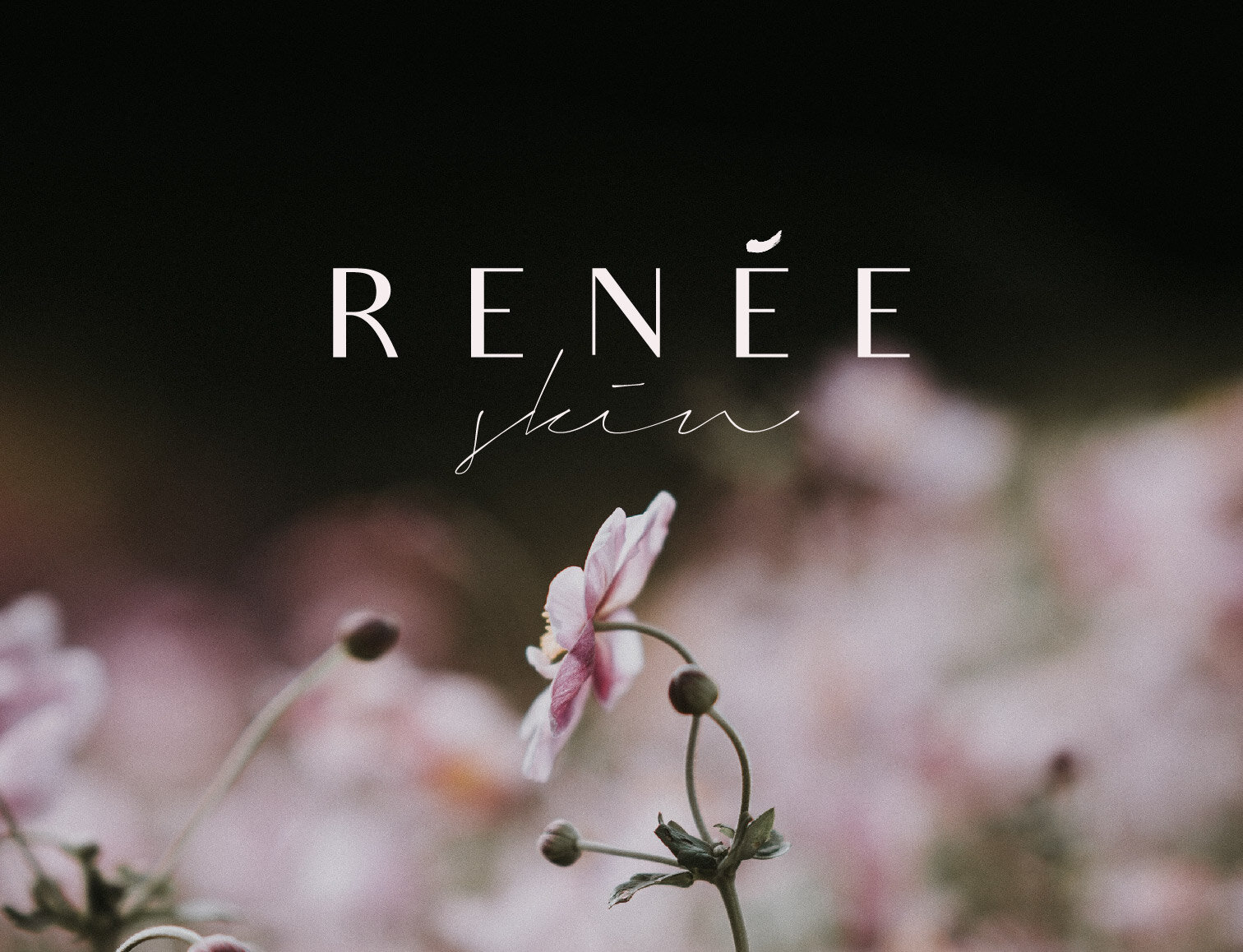
Renée is a minimal skincare brand for dry, delicate skin using natural ingredients. The accent on the 'e' is a smudge of cream and by using a combination of a sans serif font that has a Parisian feel to it with a free-flowing handwritten font, it has the nice balance of being confident and down to earth.


Ready to work with me?
View more Case Studies:


