
Judy Parsons
The challenge:
Judy needed a brand that reflected her approachable and clear teaching style as a LinkedIn trainer. Her clients often feel overwhelmed by LinkedIn, so the brand had to feel welcoming and supportive while still communicating her expertise and professionalism. It needed to say "I'll make this easy for you" without looking casual or unprofessional.
How we solved it:
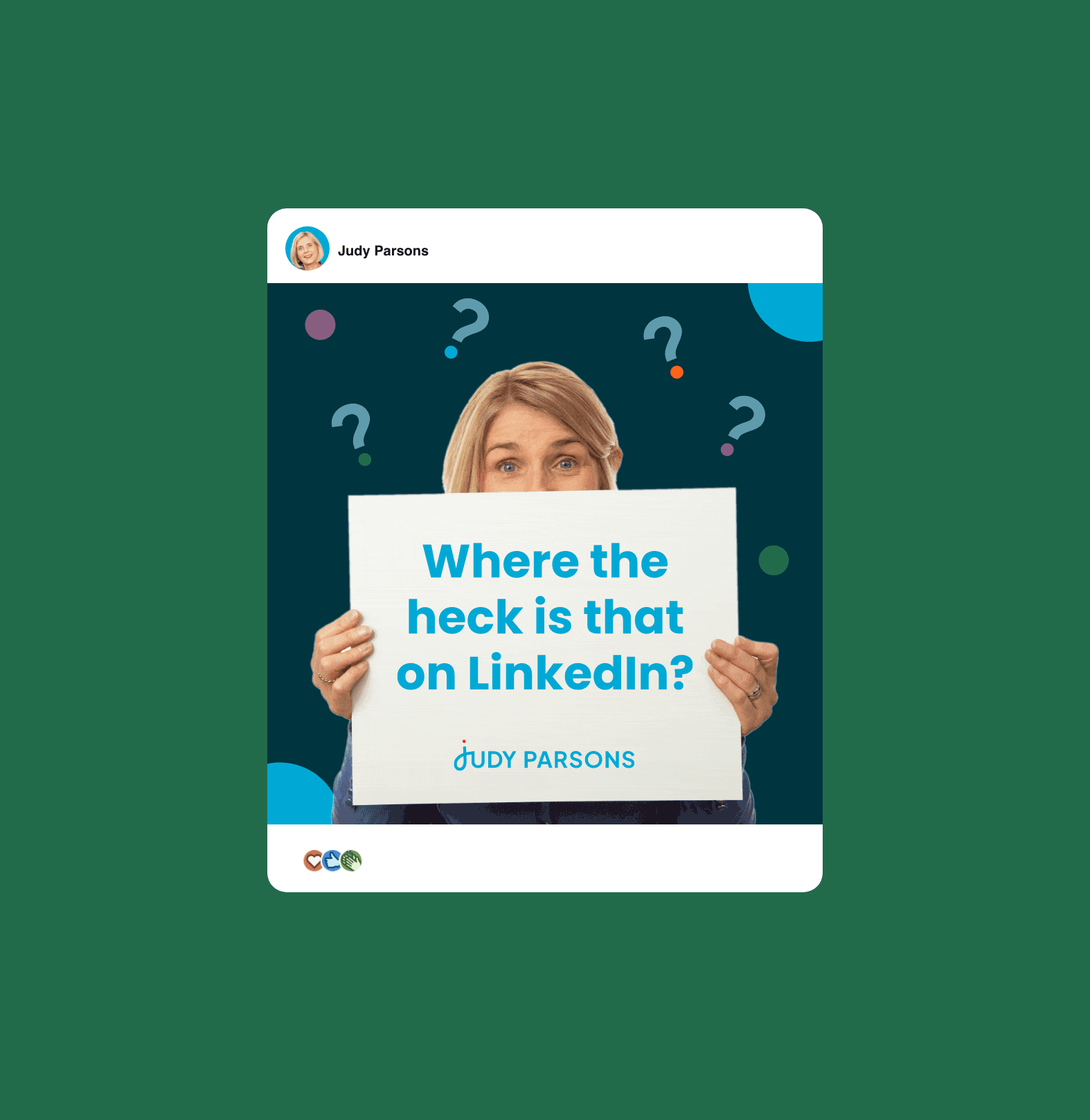
Judy's brand identity reflects her friendly, hands-on approach to LinkedIn training. The logo features a free-flowing 'j' that symbolises Judy's warm and supportive nature, while the clean typography reinforces the clarity she brings to her teaching. This balance ensures the brand feels accessible yet expert-led - making it easy for clients to trust in her guidance.
I worked alongside colour psychology expert Karen Haller who selected the colour palette, ensuring it aligned with Judy's personality and the emotions she wanted to evoke. The result is a brand identity that communicates simplicity, warmth, and professionalism - perfectly mirroring Judy's ability to make LinkedIn easy to navigate for her clients. It instills trust while maintaining a welcoming and down-to-earth feel, exactly what her audience needs to feel confident working with her.


“From the start, Catherine took the time to understand my business, my personality and my goals. She didn’t just design a logo, she crafted a professional, cohesive and striking brand identity that ties everything together seamlessly.
Not only do I love my new brand, but it’s also consistent and instantly recognisable thanks to a set of design assets that ensure I show up with clarity and confidence. Now, I have a brand that resonates with my ideal clients, helps me stand out on LinkedIn, and strengthens my presence across the web.”
Judy Parsons, LinkedIn Trainer
Ready to work with me?
View more Case Studies:


