
Intuitive Homes
The challenge:
Intuitive Homes needed to position themselves in the luxury smart home market without looking like their typical high-tech competitors. Their difference? Making technology invisible and effortless in high-end homes. The brand had to appeal to a broad audience - homeowners, developers, designers, and architects - while communicating both luxury and cutting-edge expertise.
How we solved it:
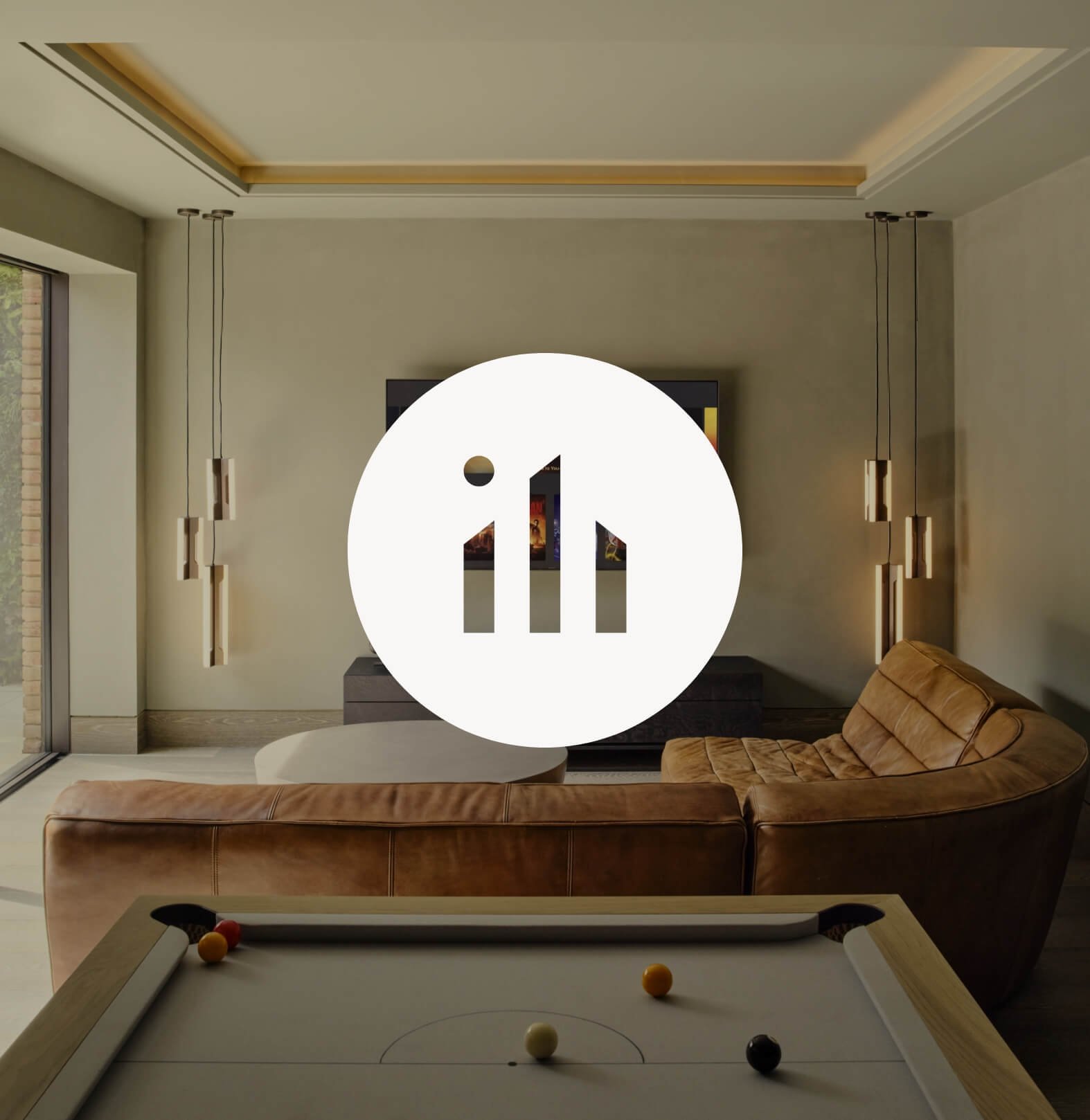
The Intuitive Homes brand identity seamlessly blends luxury with smart home technology, creating a sophisticated yet approachable visual presence. The icon is crafted from the initials 'i' and 'h', forming the shape of a house while reflecting the brand's expertise in cutting-edge technology. This clever integration symbolises the company's mission to embed intuitive, effortless smart solutions into high-end residences. The lowercase, sans-serif typography reinforces a premium yet friendly aesthetic, ensuring the brand feels both modern and fuss-free - a key aspect of its positioning.
In contrast to competitors who often use dark, high-tech imagery, Intuitive Homes embraces a softer, more refined colour palette. This approach complements the natural beauty of luxury interiors while appealing to a broader audience, including homeowners, developers, designers, and architects. The overall look is sleek, understated, and effortlessly elegant, aligning with the company's vision of making technology an invisible yet powerful part of luxury living.


“It was great working with Catherine. She really took the time to understand our objectives and there was clear communication throughout the process. We are delighted with our new brand and it really reflects the business.”
Stephen Nevison, Intuitive Homes
Ready to work with me?
View more Case Studies:


